Artsy Museum
Website design of a virtual art museum
(Project Type)
Web Design
(Year)
2023
Satisfying
the need
The main purpose of the website is to promote ticket purchases and to provide information about the museum. I wanted to communicate the luxuriousness of art throughout the website.
From analyzing competitive museum websites I could find: classic vibes, helpful services, some outdated design, simple designs that help artworks stand out, and well accessible tickets booking page.
There was some problems I had to solve. Because of the grand old history of museums, some of the pages of websites were outdated. Some websites lacked artwork search features. It wasn’t easy to find information that I needed. I came up with solutions for the problems. I had to design all pages with unity and up to date, provide categorized and detailed search options for searching artworks, develop a search feature, and have a developed navigation menu.
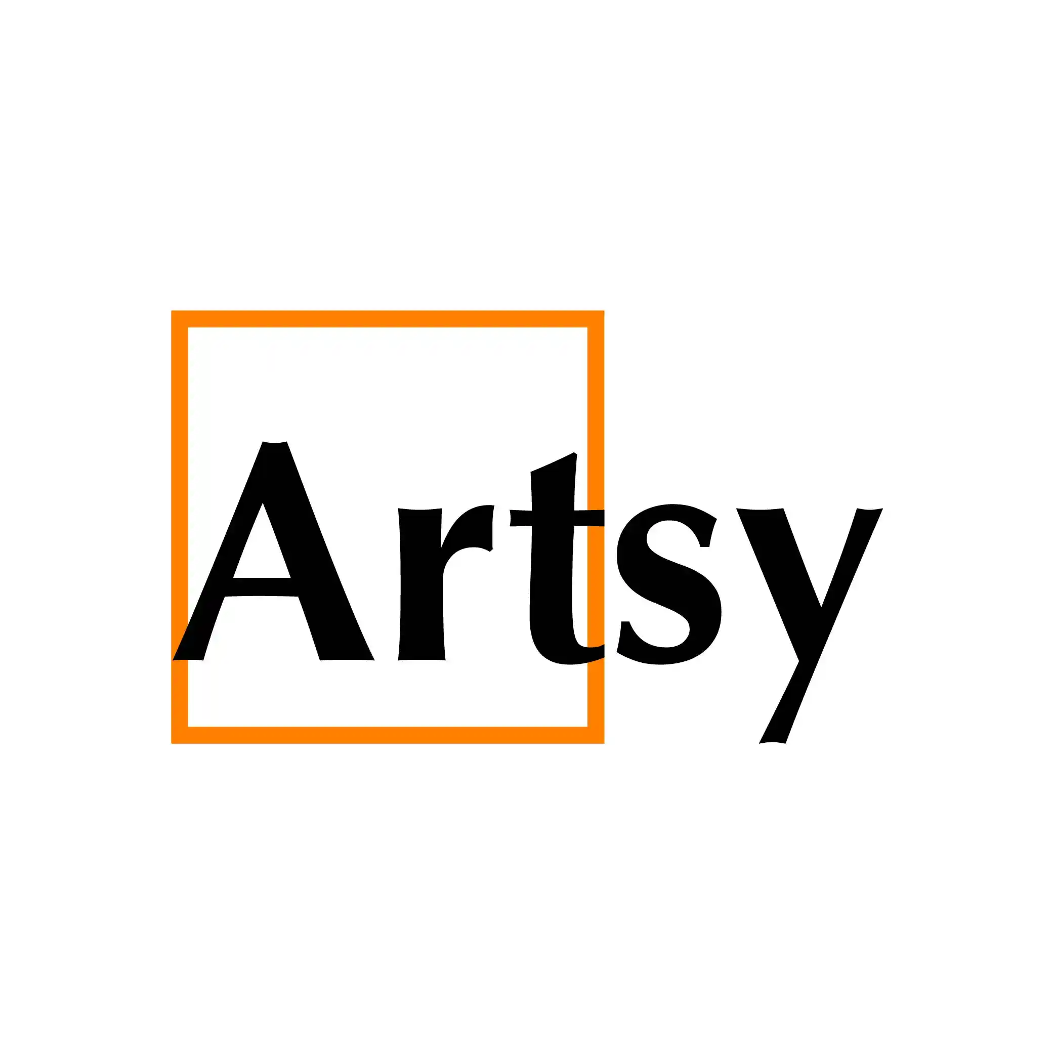
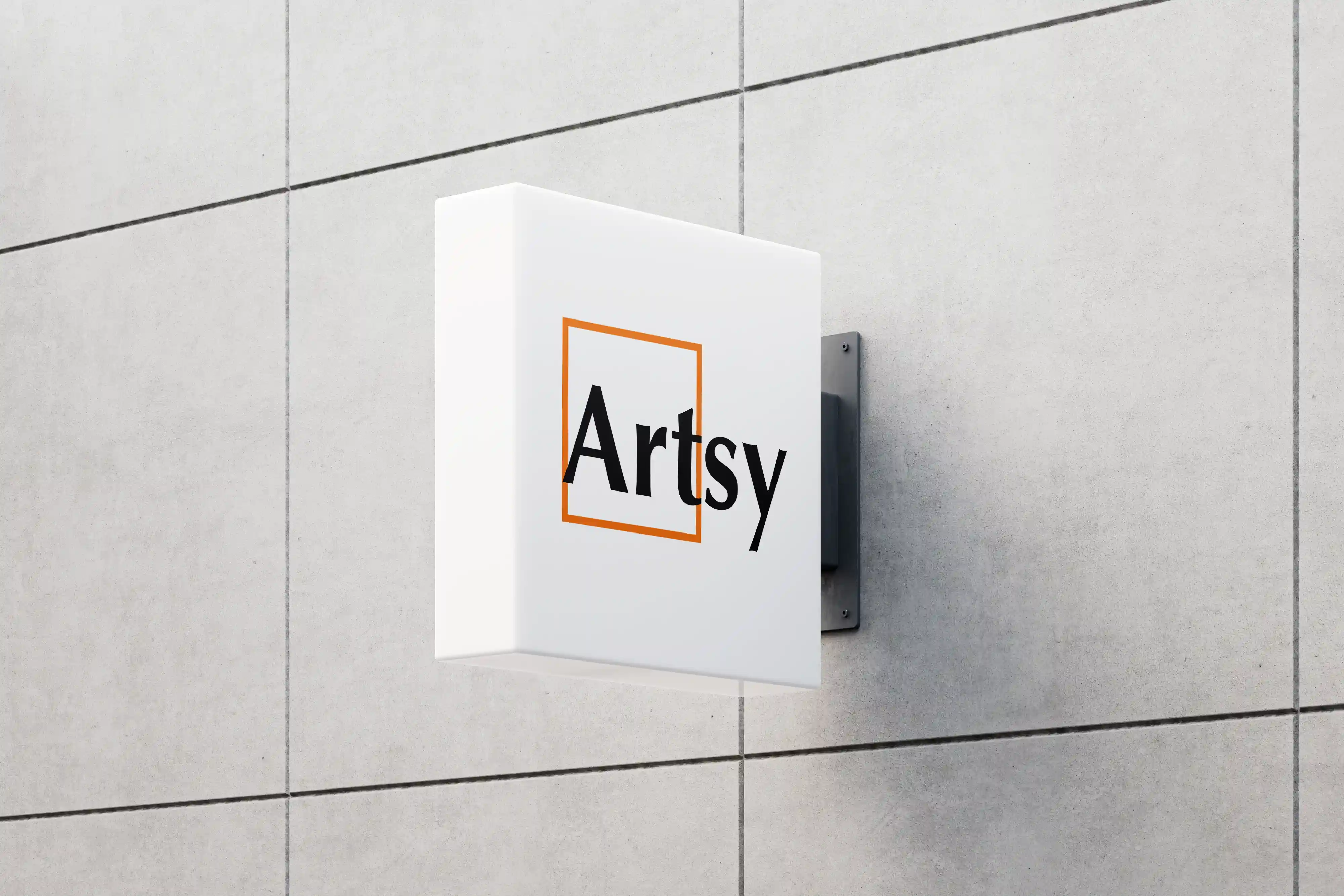
Looking at the designs, The main color orange was to represents the energy and power of art. The main design element square, represent the art and its frame. The word “Artsy” coming out of the frame shows that the artwork will give out influence beyond the artwork’s frame.
The website’s User Flow leads to the outcome of booking tickets, providing the users with opportunities to buy tickets but still giving them freedom to explore through the website.
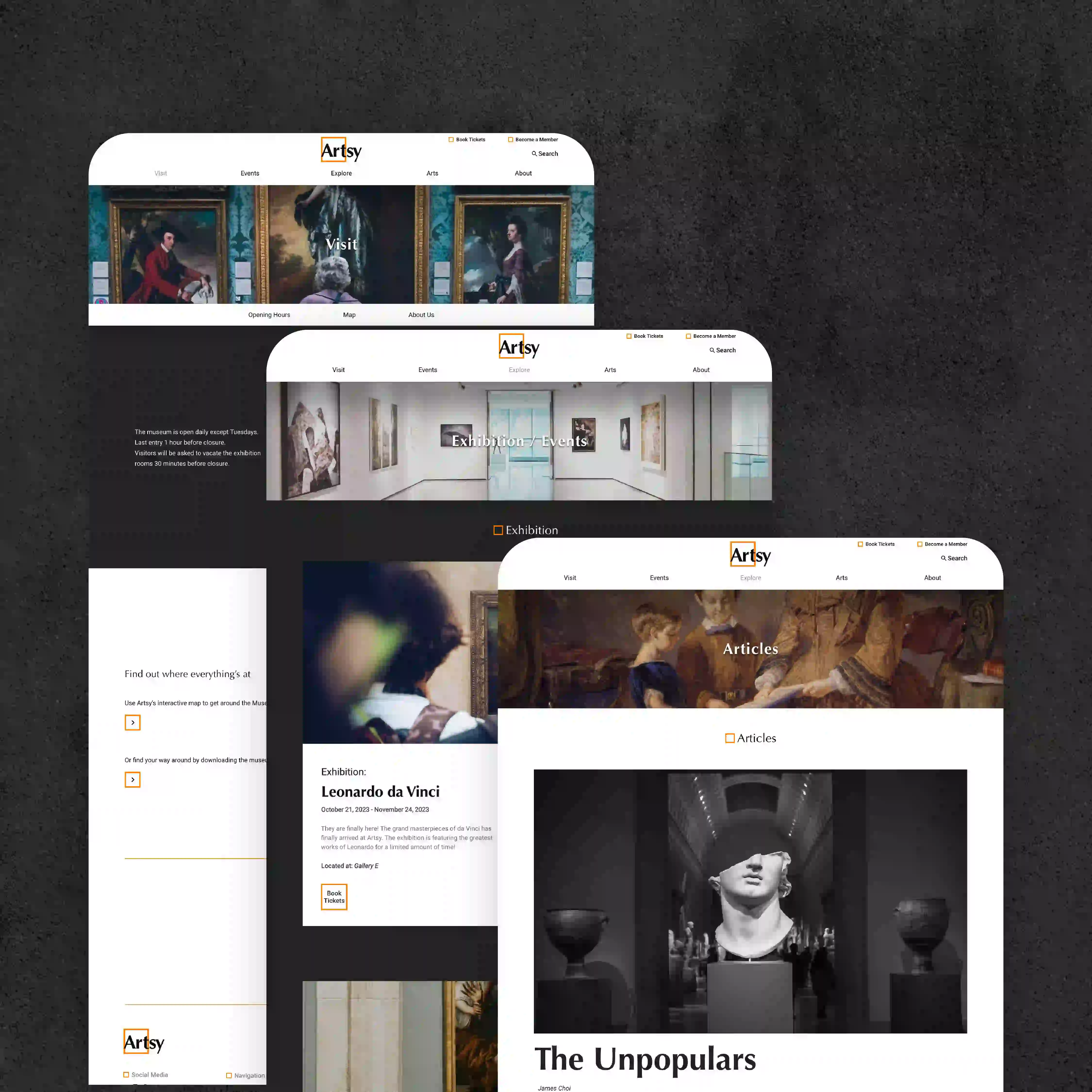
I then have experimented with the layouts by making the Low Fidelity Mockups of the website. I then transferred them into High Fidelity Mockups to see how the website looked. With the High Fidelity Mockups done, Design System were made to unify the whole website.
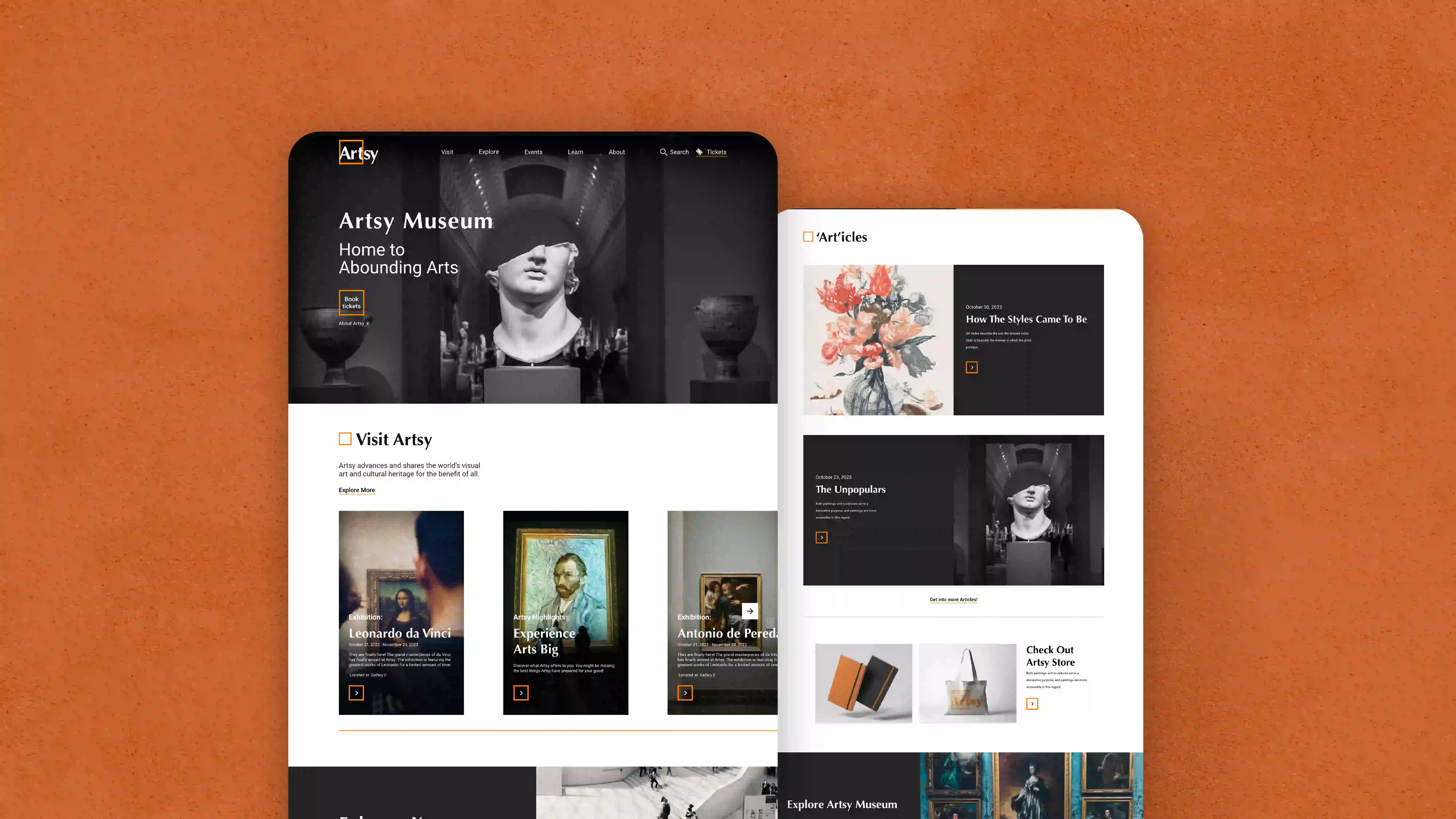
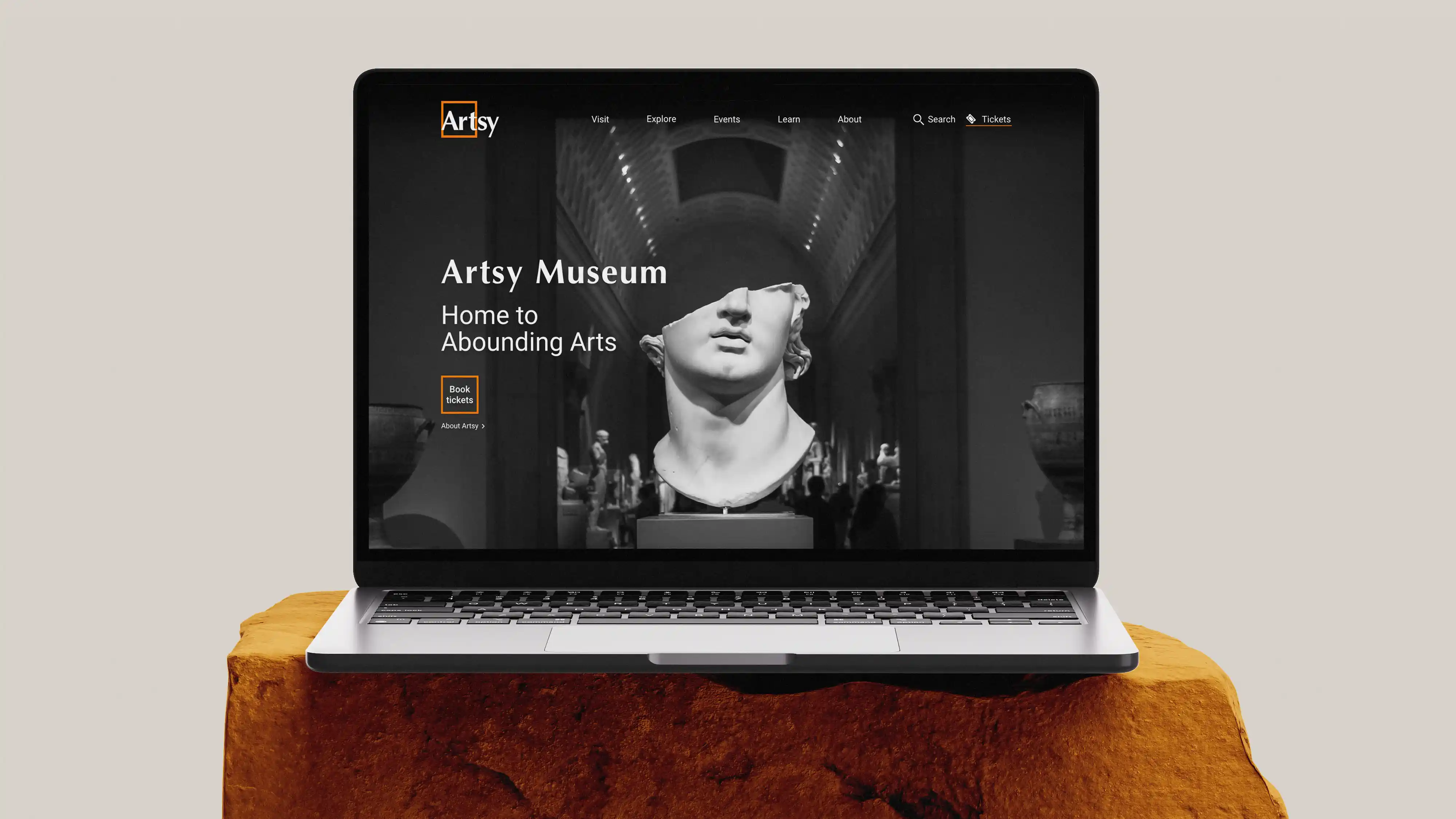
The homepage of the website was designed to provide links to each page. The rows are ordered by their importance considering what the visitors need. Additional pages were designed to provide more information of the Artsy museum.


Artsy Museum
Website design of a virtual art museum
(Project Type)
Web Design
(Year)
2023

Satisfying
the need
The main purpose of the website is to promote ticket purchases and to provide information about the museum. I wanted to communicate the luxuriousness of art throughout the website.
From analyzing competitive museum websites I could find: classic vibes, helpful services, some outdated design, simple designs that help artworks stand out, and well accessible tickets booking page.
There was some problems I had to solve. Because of the grand old history of museums, some of the pages of websites were outdated. Some websites lacked artwork search features. It wasn’t easy to find information that I needed. I came up with solutions for the problems. I had to design all pages with unity and up to date, provide categorized and detailed search options for searching artworks, develop a search feature, and have a developed navigation menu.
Looking at the designs, The main color orange was to represents the energy and power of art. The main design element square, represent the art and its frame. The word “Artsy” coming out of the frame shows that the artwork will give out influence beyond the artwork’s frame.
The website’s User Flow leads to the outcome of booking tickets, providing the users with opportunities to buy tickets but still giving them freedom to explore through the website.
I then have experimented with the layouts by making the Low Fidelity Mockups of the website. I then transferred them into High Fidelity Mockups to see how the website looked. With the High Fidelity Mockups done, Design System were made to unify the whole website.
The homepage of the website was designed to provide links to each page. The rows are ordered by their importance considering what the visitors need. Additional pages were designed to provide more information of the Artsy museum.


Artsy Museum
Website design of a virtual art museum
(Project Type)
Web Design
(Year)
2023

Satisfying
the need
The main purpose of the website is to promote ticket purchases and to provide information about the museum. I wanted to communicate the luxuriousness of art throughout the website.
From analyzing competitive museum websites I could find: classic vibes, helpful services, some outdated design, simple designs that help artworks stand out, and well accessible tickets booking page.
There was some problems I had to solve. Because of the grand old history of museums, some of the pages of websites were outdated. Some websites lacked artwork search features. It wasn’t easy to find information that I needed. I came up with solutions for the problems. I had to design all pages with unity and up to date, provide categorized and detailed search options for searching artworks, develop a search feature, and have a developed navigation menu.
Looking at the designs, The main color orange was to represents the energy and power of art. The main design element square, represent the art and its frame. The word “Artsy” coming out of the frame shows that the artwork will give out influence beyond the artwork’s frame.
The website’s User Flow leads to the outcome of booking tickets, providing the users with opportunities to buy tickets but still giving them freedom to explore through the website.
I then have experimented with the layouts by making the Low Fidelity Mockups of the website. I then transferred them into High Fidelity Mockups to see how the website looked. With the High Fidelity Mockups done, Design System were made to unify the whole website.
The homepage of the website was designed to provide links to each page. The rows are ordered by their importance considering what the visitors need. Additional pages were designed to provide more information of the Artsy museum.
